Most business owners believe one thing very strongly
“If I explain everything clearly, people will buy.”
Sounds logical.
But in reality, this mindset is silently killing conversions on thousands of websites.
Today’s users are not short on information.
They are short on attention, patience, and mental energy.
And when a website tries to explain everything, users end up doing nothing.
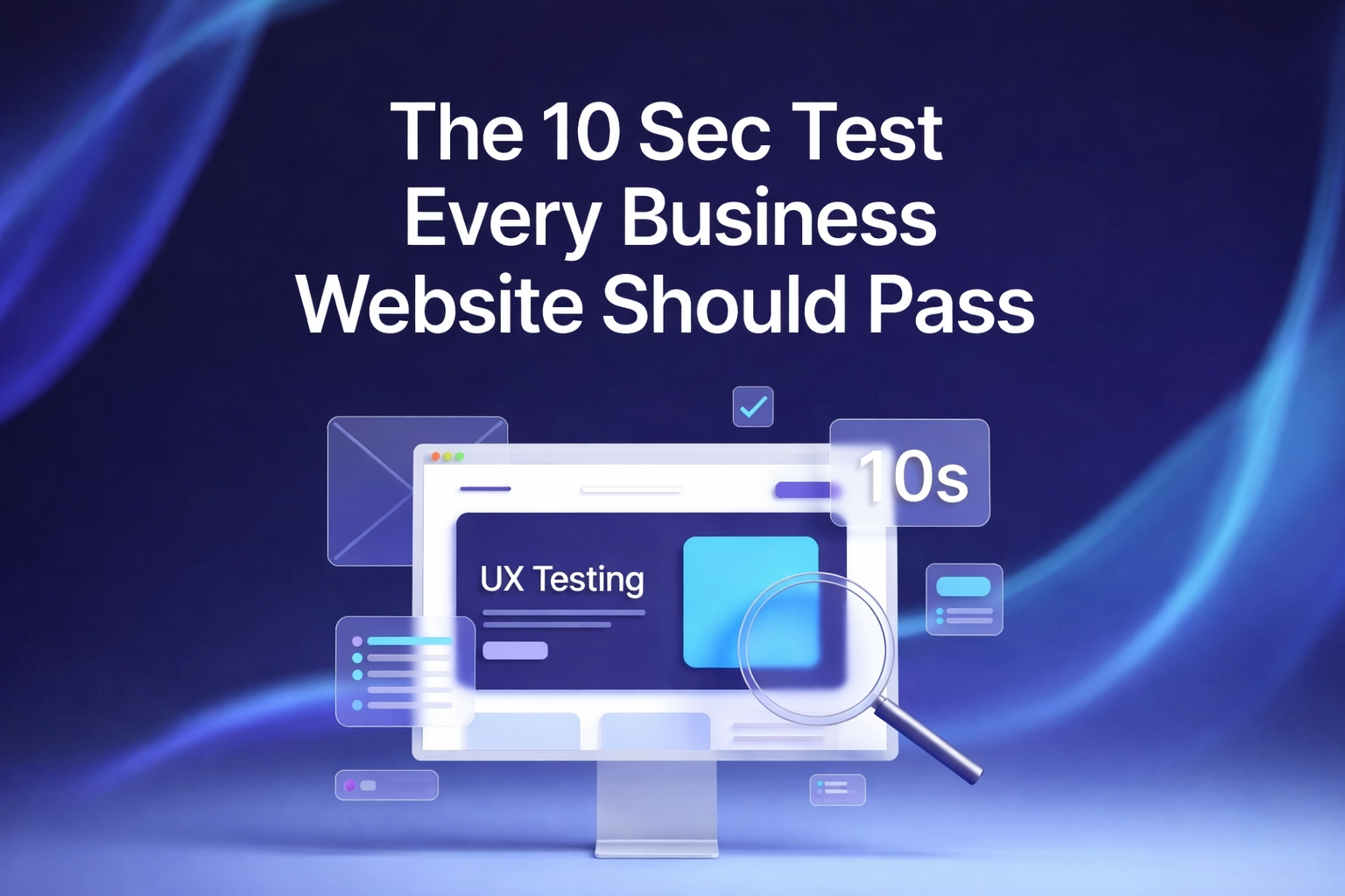
Let’s break down why more information often leads to fewer conversions and how high-converting websites actually work.
❌ The Big Myth: More Information Builds Trust
This is the most common belief we hear from clients.
More text = more clarity
More pages = more professionalism
More explanations = more trust
In reality, the opposite often happens.
When users land on a website overloaded with content, their brain reacts with one simple feeling
Overwhelm
And overwhelmed users do not convert.
They scroll, skim, get confused, and leave.
🧠 The Psychology Behind Low Conversions
⚡ Decision Fatigue Is Real
Every extra paragraph, button, section, or option forces the user to make a micro decision.
Should I read this?
Is this important?
Where should I click next?
After a point, the brain gives up.
This is called decision fatigue, and it is one of the biggest conversion killers.
High-converting websites do the opposite
They reduce decisions, not increase them.
👀 Users Do Not Read, They Scan
This hurts to accept, but it is true.
Most visitors:
• Scan headlines
• Look at visuals
• Read highlighted lines
• Ignore long paragraphs
When your website is filled with dense text, important messages get buried.
The user misses your value proposition and leaves within seconds.
🔊 When Information Becomes Noise
Not all information is bad.
Unstructured information is.
Common problems we see:
• Long introductions before the main point
• Technical explanations that users do not care about
• Multiple CTAs fighting for attention
• Features listed without benefits
• Everything treated as equally important
The result
Nothing stands out.
💡 How High-Converting Websites Use Less to Sell More
🎯 Clear Message Above the Fold
The first screen should answer three questions instantly:
What do you do?
Who is it for?
Why should I care?
No history lesson.
No long story.
Just clarity.
🎯 One Primary Goal Per Page
Every high-converting page has one job.
Book a call
Buy a product
Sign up
Request a quote
When you give users too many choices, you confuse them.
Focused pages convert.
Busy pages do not.
🧩 Progressive Disclosure Works Best
Smart websites reveal information step by step.
You do not explain everything at once.
You guide the user deeper only when they are interested.
This keeps attention high and resistance low.
📉 A Real Example We See All the Time
A service website with:
• 10 sections on the homepage
• 3 different offers
• Long paragraphs explaining the company
• Multiple buttons everywhere
Traffic is good.
Leads are bad.
After simplifying:
• Clear headline
• Fewer sections
• Shorter copy
• One strong CTA
Conversions increase without increasing traffic.
Same users.
Better structure.
🧱 Content Is Not the Enemy. Clutter Is.
This is important.
Minimal websites do not mean empty websites.
They mean intentional websites.
Every line, section, and visual should earn its place.
If it does not move the user closer to action, it should not be there.
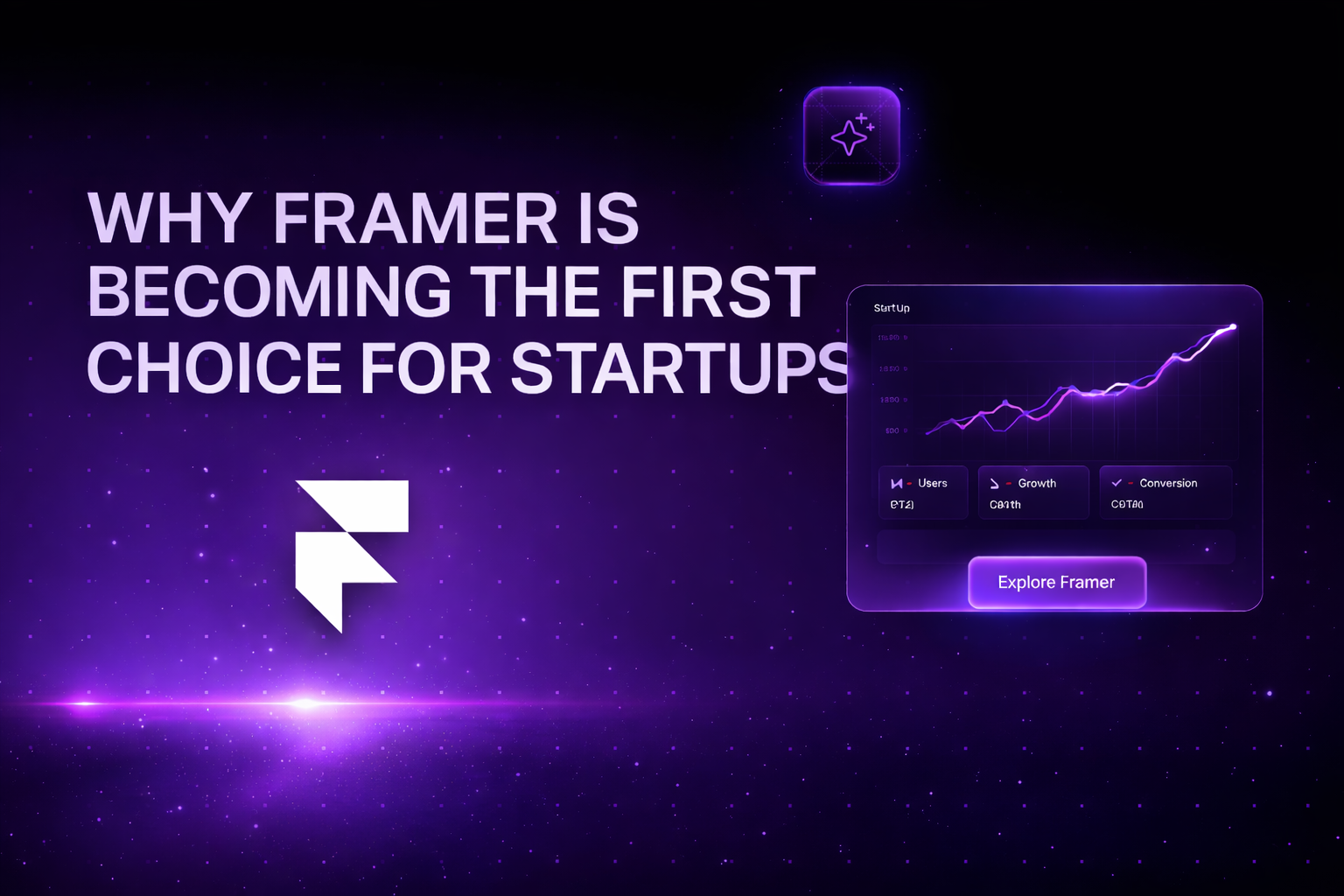
🚀 Why Framer and Modern Website Frameworks Help
Platforms like Framer are built for:
• Speed
• Clean layouts
• Visual hierarchy
• Conversion-focused design
They force clarity by design.
That is why modern startups and serious brands are moving away from cluttered traditional websites.
🎯 Final Thought
Your website is not a brochure.
It is a sales system.
And the best sales systems do not shout everything at once.
They guide, focus, and convert.
Less information.
More clarity.
Better results.
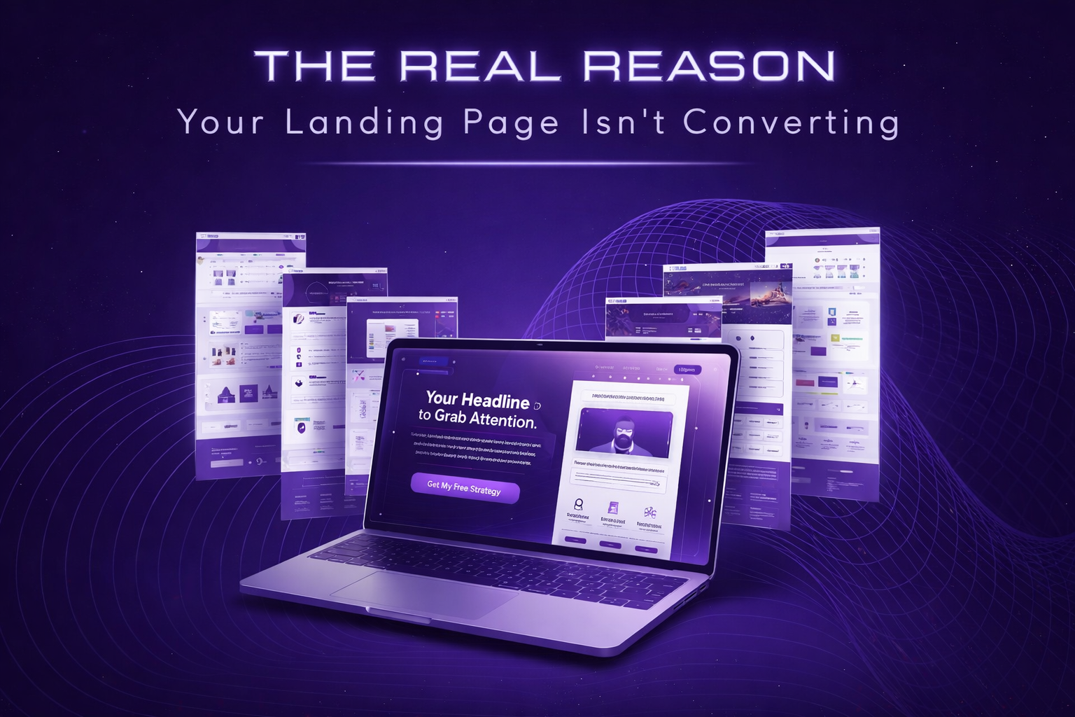
If your website looks good but does not convert, the problem is not traffic.
It is structure.
At Qubesys, we design conversion-first websites, landing pages, and Shopify stores using Framer and modern frameworks that are built to sell, not just impress.
👉 Contact Qubesys today to build a website that turns visitors into customers.
🌐 Visit: www.qubesys.com
Let’s simplify your website the right way.