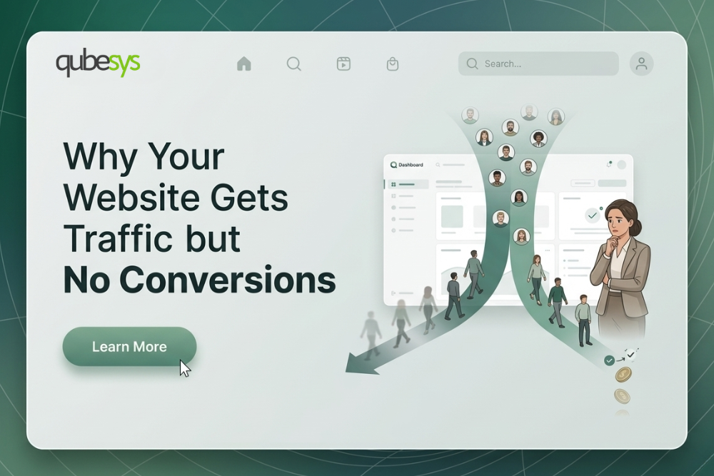
When someone visits your website, you have only a few seconds to make an impression. A potential customer may arrive through Google search, a paid advertisement, or a referral from someone who recommended your business. For a brief moment, you have their attention. However, if your website does not quickly communicate value, visitors will leave before exploring further.
This is the reality of online behavior today. Most people spend only a few seconds deciding whether a website is worth their time. That is why successful businesses design their websites around what many marketers call the 10 second test. If your website fails this test, visitors often leave before you even get a chance to explain your offer.
What Is the 10 Second Website Test?
The 10 second test refers to how quickly a new visitor can understand the purpose of your website. Within the first few seconds of landing on your page, a user should immediately know three important things:
- What your business does
- Who your product or service is for
- Why they should continue exploring your website
If a visitor cannot understand these points quickly, they will often leave and move on to another option. Online attention spans are extremely short, and users make decisions fast.
Why Many Websites Fail This Test
A large number of business websites fail not because of poor technology or outdated coding, but because they lack clarity. Businesses may spend heavily on development and design, yet still lose visitors almost immediately because the website does not communicate effectively.
Here are the most common reasons websites fail the 10 second test.
Unclear Headlines
The first thing most visitors notice is your headline. Unfortunately, many businesses use vague or overly creative messaging that sounds impressive but fails to explain what the business actually offers.
Examples of ineffective headlines include:
- Empowering digital experiences
- Innovative solutions for the future
While these may sound polished, they do not clearly explain the service or product being offered. Strong headlines should communicate value immediately and directly.
A better example would be:
- Custom Shopify Stores That Increase Online Sales
Clarity almost always performs better than creativity when it comes to homepage messaging.
Poor Visual Hierarchy
Some websites try to make every section stand out, but when everything is emphasized equally, nothing captures attention properly. Visitors can become overwhelmed if the layout lacks structure or focus.
A website should make it immediately clear where the user’s attention should go first by highlighting:
- The main message
- The key benefit
- The next step to take
Good visual hierarchy guides users naturally through the page and improves understanding.
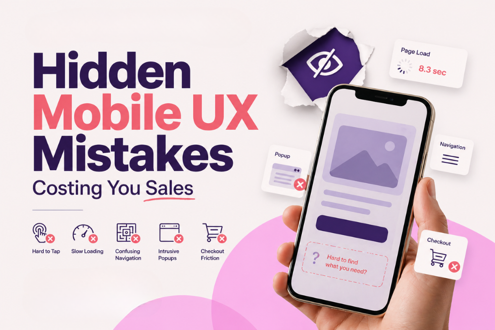
Slow Loading Speeds
Website speed has a direct impact on user behavior. If a website takes too long to load, many users will leave before even viewing the content. Even a delay of one second can reduce conversion rates significantly.
Common causes of poor speed include:
- Large unoptimized images
- Poor hosting performance
- Too many scripts or plugins
- Inefficient website development
Modern websites need to load quickly in order to maintain attention and improve user experience.
Weak Mobile Experience
A large portion of web traffic now comes from mobile devices, yet many business websites still provide a poor mobile experience. If your website is difficult to use on a phone, users are likely to leave immediately.
Common mobile usability issues include:
- Small unreadable text
- Broken layouts
- Buttons that are difficult to tap
- Poor spacing between sections
A website should be designed with mobile users in mind from the start.
How High-Converting Websites Pass the Test
The most effective websites are structured to make information clear and accessible immediately. They are intentionally designed to guide visitors through a simple and logical experience from the first moment.
Strong Hero Sections
The hero section is the first visible section of a website, and it plays a major role in shaping first impressions. A high-performing hero section should quickly answer three questions:
- What do you offer?
- Who is it for?
- Why should the visitor care?
An effective hero section typically includes:
- A clear and compelling headline
- Supporting text for context
- A visible call to action
- A relevant visual or image
This combination helps users understand your offer instantly.
Clear Calls to Action
Visitors should never be uncertain about what to do next. Every website should guide users toward a specific action, whether that is making a purchase, booking a consultation, or contacting your team.
Examples of strong calls to action include:
- Book a Consultation
- Explore Our Services
- Start Your Free Trial
- View Products
Too many competing calls to action can create confusion, so simplicity is key.
Trust Signals
Trust is one of the most important factors in conversion. Visitors naturally want reassurance before engaging with a business online. Websites that establish credibility early are far more likely to retain attention.
Common trust-building elements include:
- Client logos
- Testimonials
- Ratings and reviews
- Case studies or portfolio examples
These signals help reduce hesitation and improve confidence.
Clean and Professional Design
Good design is not only about appearance. It is about making information easy to understand and interact with. A clean and modern design improves readability, professionalism, and trustworthiness.
Effective design principles include:
- Consistent spacing
- Clear typography
- Balanced layouts
- Minimal clutter
A polished design supports communication and improves the overall experience.
Test Your Website for Yourself
A useful way to evaluate your website is to test it honestly from the perspective of a new visitor. Open your website on a phone, set a timer for 10 seconds, and ask yourself:
- Is it immediately clear what the business offers?
- Is the value proposition easy to understand?
- Is the next step obvious?
If the answer to any of these questions is no, your website may be losing valuable traffic and leads without you realizing it.
Why First Impressions Matter More Than Ever
Your website is more than just an online brochure. It is often the first interaction a customer has with your business and serves as a 24-hour sales tool. A website that communicates clearly can help your business:
- Generate more leads
- Increase conversion rates
- Build trust with visitors
- Improve online credibility
Businesses that succeed online are the ones that make their value clear immediately and guide visitors effectively from the very first click.
Make Every Second Count
Online attention is limited, and your website only has a small window to make an impact. If visitors do not understand your value quickly, they will move on. Passing the 10 second test is not about flashy design or complex animations. It is about clarity, usability, and strategic communication.
At QubeSys, we design modern, high-converting websites that are built to capture attention and turn visitors into customers. Whether you need a conversion-focused landing page, a premium Framer website, or a performance-driven Shopify store, our team builds every project with strategy and results in mind. If your website is not generating the results you expect, contact QubeSys today and let us help you create a website designed to grow your business.
Subscribe To Receive The Latest Updates
We talk about tech only
Add notice about your Privacy Policy here.