

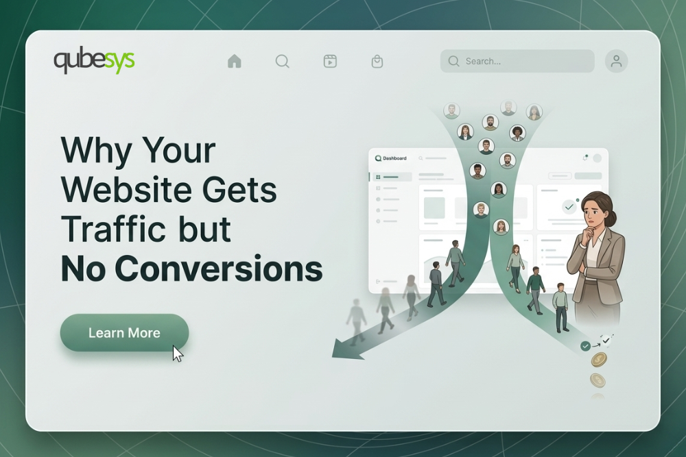
In those moments, people do not analyze your design carefully. They react emotionally to friction. If the website feels slow, confusing, cramped, or irritating, trust disappears almost instantly. Visitors rarely complain about bad mobile experiences. They simply leave and never return.
This silent exit is what makes poor mobile UX dangerous. Businesses continue spending money on marketing campaigns without realizing the real problem starts after the click.
The Three Second Judgment That Decides Whether People Stay
Mobile users make decisions incredibly fast. Before reading your services or understanding your offer, they already judge whether your website feels reliable. A delayed loading screen, jumping layouts, oversized popups, or cluttered sections create an immediate sense of frustration.
Many companies overload their mobile websites with animations, oversized videos, and unnecessary effects because they want the brand to feel modern. On actual mobile devices, especially with weaker internet connections, these elements often destroy the experience instead of improving it.
A frustrating mobile experience usually creates reactions like these:
- “This site feels broken.”
- “Why is this taking so long?”
- “I cannot find anything.”
- “I will check later.”
- “This feels unprofessional.”
Most users never come back after that moment. The exit happens quietly, but the lost revenue adds up over time.
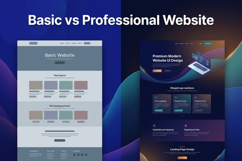
When Beautiful Desktop Design Becomes a Mobile Disaster
A website can look exceptional on a large desktop monitor and still fail completely on mobile devices. This happens more often than businesses realize. Layouts that feel spacious on desktop suddenly become overwhelming on smaller screens.
Text becomes cramped. Buttons become difficult to tap. Navigation menus become confusing. Important information gets buried under endless scrolling sections. What once looked polished now feels exhausting to use.
The difference between poor and effective mobile experiences often comes down to usability, not visual beauty.
| Weak Mobile Experience | High Converting Mobile Experience |
|---|---|
| Tiny buttons close together | Large thumb friendly tap areas |
| Long cluttered sections | Clear content hierarchy |
| Complex navigation menus | Simple navigation flow |
| Heavy animations everywhere | Fast and responsive interactions |
| Hard to read text blocks | Clean readable formatting |
Businesses that understand this difference create websites that feel effortless on mobile, not just visually impressive.
The Hidden Frustration Caused by Bad Touch Design
Desktop users click with precision. Mobile users tap quickly with their thumbs. Many websites ignore this difference completely.
Small buttons and tightly packed clickable elements create constant accidental taps. Customers trying to open a product page suddenly hit another link by mistake. They try closing a popup but accidentally open it instead. After a few frustrating interactions, people stop trying.
This issue becomes even more damaging in ecommerce stores where users are already making fast buying decisions. Every frustrating interaction increases the chance of cart abandonment.
Good mobile UX feels invisible. Users move naturally through the experience without resistance.
Why Aggressive Popups Push Visitors Away
Businesses often install popups everywhere because they want more leads, email subscribers, or sales. On mobile devices, aggressive popups usually damage engagement more than they help.
A visitor opens the website and instantly faces a fullscreen popup asking for contact information before even understanding the brand. Another popup appears seconds later offering a discount. Then a notification request blocks the screen again.
Instead of feeling guided, the customer feels interrupted.
Smart mobile experiences understand timing. Visitors should first experience the value of the website before being asked for action. Respecting user attention creates stronger engagement than forcing constant interruptions.
The Checkout Experience That Quietly Kills Sales
Many businesses blame pricing or competition for low sales when the real problem exists inside the mobile checkout experience.
A customer decides to buy, but suddenly faces endless form fields, confusing layouts, slow loading payment screens, and forced account creation steps. What started as a quick purchase now feels like work.
Mobile checkout optimization directly affects conversion rates because phone users expect speed and simplicity.
| Checkout Mistakes That Lose Sales | Checkout Experiences That Convert Better |
|---|---|
| Long forms with too many fields | Short simplified forms |
| Forced account registration | Guest checkout options |
| Difficult input fields | Mobile optimized field layouts |
| Confusing payment process | Clear step by step flow |
| Limited payment flexibility | Multiple payment methods |
Businesses often focus heavily on attracting customers but overlook the final moments where buying decisions actually happen.
Poor Mobile Readability Makes People Leave Faster
Many websites still treat mobile reading as an afterthought. Small fonts, weak contrast, and oversized text blocks make content exhausting to consume.
Mobile users scan quickly. They want clarity without effort. If reading feels uncomfortable, attention disappears immediately.
Strong readability creates a smoother experience because users absorb information naturally. Good spacing, clean typography, and structured layouts make content feel approachable instead of overwhelming.
This becomes especially important for service businesses where trust depends heavily on communication clarity.
Customers Associate Mobile Experience With Brand Quality
People judge businesses based on digital experiences more than ever before. A poor mobile website does not just create usability problems. It changes how customers perceive the company itself.
When a site feels outdated, slow, or difficult to navigate, visitors subconsciously assume the business may also be disorganized or unreliable. On the other hand, a smooth mobile experience creates confidence before a conversation even begins.
That perception matters in competitive industries where customers compare multiple businesses within minutes.
The Businesses Growing Faster Already Understand This
The companies winning online are not always the ones spending the most on ads. Many succeed because their mobile experiences reduce friction better than competitors.
Their websites load quickly. Navigation feels natural. Content is easy to consume. Forms are simple. Checkout processes feel smooth. Every interaction respects the user’s time.
This creates stronger engagement, lower bounce rates, better SEO performance, and higher conversions without forcing customers through frustrating experiences.
The Real Cost of Ignoring Mobile UX
Poor mobile UX rarely creates obvious warning signs at first. Instead, businesses slowly lose opportunities they never notice.
Potential customers leave before filling forms. Shoppers abandon carts midway. Visitors bounce before reading services. Ad campaigns underperform. SEO rankings weaken because engagement signals decline.
The business keeps investing in traffic acquisition while the website quietly pushes visitors away.
QubeSys helps businesses build high performance Framer websites, conversion focused landing pages, and optimized Shopify stores designed specifically for modern mobile behavior. If your website feels outdated, slow, or difficult to use on mobile devices, contact QubeSys to create a faster, cleaner, and conversion focused digital experience that keeps visitors engaged and turns more visitors into paying customers.